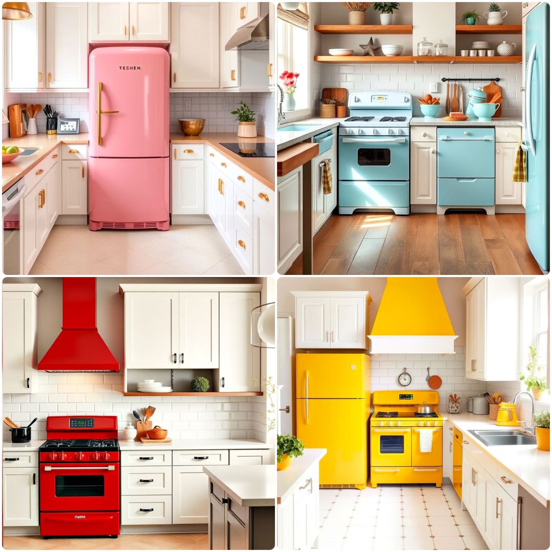
Beyond Basic White: Navigating Kitchen Appliance Color Choices Since the First Hues
For decades, our kitchens were largely a sea of white or utilitarian chrome, functional but often bland. Then, a quiet revolution began, forever changing how we perceive our cooking spaces. From my 15+ years on the ground in kitchen design and renovation, I’ve seen firsthand how the availability of color transformed not just individual appliances, but the entire philosophy of kitchen aesthetics, leading to both brilliant designs and regrettable choices.
The Color Revolution Begins: Unveiling the Pioneer
When clients ask me about the history of appliance colors, I always point to a true icon: the KitchenAid stand mixer. While rudimentary mixers existed earlier, it was KitchenAid, particularly with models like the K in the late 1930s and gaining wider traction post-WWII, that really introduced the idea of a kitchen appliance as a statement piece available in multiple vibrant hues beyond the standard white or cream. Suddenly, this powerful tool wasn’t just hidden away; it was proudly displayed, a splash of personality on the countertop.

I remember one of my earliest projects where a client had inherited her grandmother’s original mint green KitchenAid. She wanted to build her entire modern kitchen around that single, cherished piece, proving how deeply these early color introductions resonated. It became the anchor, the historical touchstone in a contemporary space, a testament to the enduring appeal of thoughtful color.
Beyond the Mixer: Refrigerators Join the Hue Parade
Following the lead of smaller appliances, the mid-20th century saw major household items, notably refrigerators, break free from their monochromatic constraints. The 1950s, in particular, ushered in an era of pastel refrigerators—think robin’s egg blue, flamingo pink, and butter yellow. Manufacturers like General Electric and Frigidaire capitalized on the post-war boom and the desire for cheerful, personalized homes.
I’ve assisted countless clients trying to capture that authentic mid-century modern feel. Many beginners make the common mistake of thinking simply dropping a retro-colored fridge into a contemporary kitchen will achieve the look. In reality, without careful consideration of cabinetry, flooring, and even wall art, that beautiful vintage-inspired appliance can look isolated or, worse, like a novelty rather than an integrated design element. It’s about creating a cohesive narrative, not just adding a prop.
Common Mistakes I’ve Seen in Appliance Color Selection
Drawing from years of guiding clients through the maze of kitchen choices, I can tell you that appliance color selection is a minefield for the unwary. Here are some of the most frequent missteps I’ve observed:
- Chasing Fleeting Trends Blindly: Remember the brief but intense craze for all-red kitchens? Or the sudden surge of avocado green in the 70s? I’ve had clients regret these choices within a few years, finding their once-bold statement had become dated and tiresome. If you love a trend, great, but consider how long you’ll love it before committing to a major appliance.
- Ignoring the Kitchen’s Overall Palette: A classic beginner error is choosing an appliance color in isolation. I once worked with a couple who bought a striking matte black refrigerator because they loved the aesthetic, but their kitchen had warm, honey-toned oak cabinets and a cream-and-brown granite. The fridge, while beautiful on its own, created a jarring, disjointed feel, clashing rather than complementing. The best kitchens have a harmonious flow.
- Forgetting Maintenance and Durability: Some finishes, while stunning, are practical nightmares. Glossy black appliances, for instance, are fingerprint magnets. Certain matte finishes can be prone to showing scuffs or being harder to clean than their stainless steel counterparts. Clients often fall for the look in the showroom but quickly discover the daily grind of keeping it pristine is too much. Practicality must always factor into the aesthetic decision.
- Not Considering Resale Value: While your kitchen should reflect your personality, if you plan to sell your home within a decade, extremely niche or bold appliance colors can deter potential buyers. I’ve seen homes linger on the market because a unique lime green oven, while loved by the owner, was a deal-breaker for others. Sometimes, it’s best to keep major appliances in more universally appealing finishes and save bold statements for easily replaceable items.
Integrating Color Today: My Practical Approach as a Practitioner
My role isn’t just to install; it’s to guide. When clients are torn between a neutral look and a splash of color, I always start by asking, "What feeling do you want your kitchen to evoke?" Is it calm and serene? Energetic and vibrant? Elegant and sophisticated?
Once we establish the mood, we discuss strategy. For major appliances like refrigerators and ovens, I often lean towards integrated panel-ready options or classic neutrals like stainless steel, white, or black. This provides a timeless foundation. The true magic then happens with smaller appliances, a statement range, or even colorful backsplash tiles. I recently helped a client select a beautiful cobalt blue range. Instead of overpowering the room, we balanced it with off-white custom cabinetry and a subtly veined quartz countertop, making the range a deliberate, artistic focal point rather than an overwhelming presence. It’s about strategic impact, ensuring color enhances, not detracts, from the overall design.
| Appliance Color Strategy | Pros | Cons | Best Use Scenarios (My Experience) |
|---|---|---|---|
| Classic Neutrals (Stainless Steel, White, Black) | Timeless appeal, high resale value, easy to match other elements, widely available. | Can sometimes feel sterile or lack unique personality if not accessorized well. | Foundational elements in any kitchen, small spaces, rental properties, broad market appeal for resale. |
| Integrated/Panel-Ready (Matches Cabinetry) | Seamless, custom look; hides appliances for a minimalist or traditional aesthetic; highly sophisticated. | Higher upfront cost, less flexibility if kitchen design changes significantly, requires precise cabinet matching. | High-end custom kitchens, minimalist designs, open-concept spaces where you want appliances to disappear. |
| Statement Colors (Bold Ranges, Custom Hoods, Small Appliances) | Personalizes space, creates a focal point, expresses unique style and flair, visually dynamic. | Can dominate the room, potential to look dated over time, might deter future buyers, harder to coordinate. | Accent pieces (e.g., a single bold range), specific design themes (retro, industrial chic), small appliances. |
My Pro Tips for Appliance Color Confidence
- Anchor with Neutrals, Accent with Color: My rule of thumb, especially for major, costly appliances like refrigerators and built-in ovens, is to stick with neutral tones. This provides longevity and flexibility. Reserve your bold statements for smaller, more easily replaceable appliances (like that vibrant KitchenAid mixer) or a single, impactful piece like a range or a custom hood. This way, you get your personality without expensive commitment.
- Borrow from Your Surroundings: Don’t make appliance color an isolated decision. Look at your existing flooring, wall color, the natural light in the room, and even adjacent rooms that are visible. I’ve often seen clients bring in fabric swatches or paint chips from other areas of their home to our showroom to ensure a cohesive flow. This holistic approach prevents your kitchen from feeling disjointed.
- Test Swatches, Not Just Online Photos: Colors render dramatically differently in real life than on a screen, and under various lighting conditions (natural vs. artificial, warm vs. cool light). Always, always try to see actual physical samples or visit showrooms. If possible, I encourage clients to take swatches home and observe them in their own kitchen environment throughout the day.
- Consider Finish as Much as Hue: The texture and sheen (matte, glossy, brushed, enamel) dramatically impact how a color appears and how it holds up to daily use. A matte black refrigerator will feel very different, both visually and tactilely, from a glossy black one. The finish affects how light reflects, how dirt shows, and the overall durability. Discuss these aspects with your designer or read reviews for real-world insights.